An attractive homepage in Figma rarely shows how the website works when content runs long, data is missing or a form returns an error. The right review criteria help you identify gaps before they become costly code changes.
The homepage looks finished in Figma, but gaps begin to appear as soon as the developer asks how the form behaves when an error occurs, how the mobile menu works or what visitors see while content is loading. It often becomes clear that you have approved a static image rather than a fully developed Figma prototype. The difference becomes costly when unanswered questions must be resolved after components, integrations and content models have already started being built. This article helps small and medium-sized business owners review web designs and approve design proposals based on real user situations, not just polished standard pages.

What you are actually approving in a Figma prototype
A design file can contain finished colours, fonts, images and page templates without explaining how the website works. A Figma prototype goes further by connecting views and showing what happens when users open a menu, submit a form, filter a list or encounter a problem. It should not replace the finished website, but it should make key decisions visible before development begins.
Imagine a service page with a button that opens a booking flow from an external system. In the polished standard view, visitors see the service and the button, but the developer needs considerably more information. Should the flow open on the page or in a separate window? What should be shown if the integration responds slowly, no appointments are available or a step fails? Should users be able to go back without losing their selections? If the answers are missing, the design work effectively moves into the development phase.
That is where rework occurs. A decision that appears minor can affect how the component is structured, what data is retrieved, how errors are handled and what needs to be tested. If a form is initially built for a simple successful outcome and later needs to support several types of errors, retained values and clear focus management, the change may affect both the interface and the underlying logic. The cost is therefore not limited to redrawing a box; technical decisions that have already been made must also be reopened.
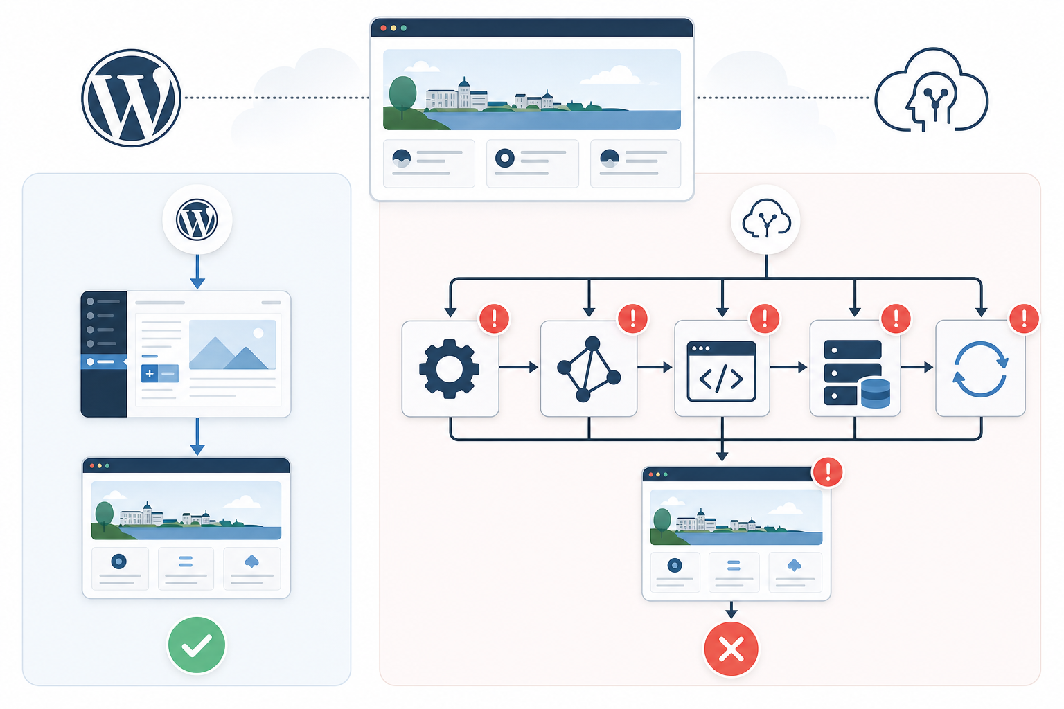
In 2026, this review is particularly relevant because many websites combine content from a CMS with search features, external services and components that change in response to visitors’ choices. A WordPress page may, for example, contain both editorial blocks and information from an integration. A React-based interface can change state without reloading the entire page. The more dynamic the solution, the less a static desktop view reveals about the finished experience.
This is how we would approach the review: start with what the user is trying to achieve and follow the task from beginning to end. Colour adjustments and exact spacing may still need to be assessed, but they should not overshadow questions that affect the business. If a potential customer does not understand that a form has been submitted, cannot find their way back through the mobile menu or interprets an empty search result as a technical error, they may abandon their enquiry. The prototype’s main value is therefore to make these risks open for discussion while they are still inexpensive to resolve.
Review the Figma prototype’s flows and states—not just the standard pages
The first thing we examine is whether the agency can demonstrate the complete process for the website’s most important features. Every flow has a state before interaction, often a waiting state and an outcome. That outcome may also be successful, empty, cancelled or unsuccessful. When only the successful outcome has been designed, the developer must interpret everything else, and that interpretation may not align with the organisation’s needs or tone of voice.
Consider a contact form as a practical example. The first view shows empty fields and a button. If the user enters an invalid email address, a view is needed in which the error appears next to the correct field, but simply adding red text is not enough. The prototype or its comments should explain whether the field is highlighted, whether focus moves to the first error and whether previously entered information is retained. For a business owner, the commercial consequence is straightforward: visitors should be able to correct their mistake without starting again or wondering what happened.
The next decision concerns what happens when the form is submitted. A disabled button displaying “Sending” can work well because it shows that the click has been registered and discourages repeated attempts. A larger content list will often require a different solution, such as placeholders that resemble the upcoming layout. The purpose is not to fill the page with animations, but to explain the wait and keep the interface stable while the system is working.
After submission, the prototype should distinguish between a confirmation and a technical error. The confirmation needs to explain what has happened and what the user can expect next. A technical error should instead provide a reasonable way forward: try again, check the information, use another contact method or return later. The wording should be understandable even if the underlying cause is an API error or network interruption; technical error codes rarely help someone who is trying to become a customer.
Empty states require the same care. “No content has been published yet” means something different from “your search returned no results”, and both differ from “the content could not be retrieved”. In the first case, the page can explain what will eventually be displayed there. In the second, users can be helped to change their search terms or clear filters. In the third, the interface needs to make it clear that the problem concerns data retrieval so that visitors do not assume the available selection is genuinely empty.
Ask the agency to demonstrate priority flows even when something goes wrong. The prototype does not need to simulate a real network connection, but it should show the agreed states and how users move between them. This also makes the handover to the developer clearer: the design describes not only what each box looks like, but why it is displayed and what the next possible action is.

The mobile view must show real decisions, not just a narrower homepage
The most common pitfall we see in mobile reviews is that the homepage has been drawn inside a narrow frame while the difficult features still exist only in desktop format. The result looks responsive in the presentation but reveals nothing about tables, filters, forms, modals or long footers. These are precisely the areas where limited space forces priorities to be set.
A mobile view is not a desktop view in which columns automatically stack on top of one another. If a page contains an introduction, an information box, a form and related content, someone needs to decide the order in which those elements should appear. Perhaps the form should appear earlier on mobile because it contains the page’s primary action. Perhaps supplementary facts should be collapsible, while contact details should always remain visible. These choices affect how quickly customers reach their goal and should therefore be owned by the design and the business, not left to a default rule in the code.
The mobile menu is a clear test of the prototype’s maturity. A menu icon on its own only shows how the navigation opens. The agency should also show the menu in its open state, what a submenu looks like, which page is active and how users return to the previous level. If the desktop header contains a prominent contact button, you also need to see where it appears on mobile and whether it remains easy to find when the menu is closed.
Tables require different decisions. A simple table can sometimes use horizontal scrolling, while a comparison table may need to prioritise certain columns or be reformatted as cards. There is no universal solution because the right choice depends on what readers need to compare. The prototype should therefore show real content and explain what happens to lower-priority information rather than simply making the text smaller.
Forms need to be reviewed with the on-screen keyboard in mind. When the keyboard opens, the visible area becomes smaller, error messages can make the form taller and buttons may move outside the viewport. Imagine a form in which several fields contain errors at the same time and the bottom button is fixed to the edge of the screen. Without a considered solution, the button may cover content or give the impression that the user cannot continue.
The same applies to modals—dialogue boxes displayed on top of the page. On a large screen, they can be centred with plenty of surrounding space. On a phone, you need to know whether they fill almost the entire viewport, how the content scrolls and where the close button is located. The prototype should also include comments about details that are not always visible in an image, such as whether the dialogue can be closed with the Escape key and where focus returns after it closes. This provides a more predictable experience for keyboard users and other visitors alike.
You do not need to demand a unique design for every phone model. A better approach is to select representative widths, review the most complex tasks at those widths and supplement them with rules describing what happens between views. Then open the shared prototype link on a physical phone. It will quickly become apparent whether touch targets are too close together, important text appears too far down the page or a menu feels considerably more complicated than it did on a computer screen.

Test the prototype with difficult but credible content
Figma web designs are often presented with headings of similar lengths, carefully cropped images and short text that fits perfectly within the components. This creates an attractive overall impression but conceals how the website will work when editors begin publishing real content. A robust design should not assume that every heading is the same length or that every image is supplied in perfect proportions.
Imagine three article cards next to one another. The first has the heading “About us”, the second has a long, descriptive project title and the third has no introduction. Should the cards have different heights, should the heading be truncated or should the buttons still align? None of these answers is automatically correct. What matters is that the choice is made deliberately and that the editor understands the component’s limitations.
Figma features such as component variants and Auto Layout can help the designer show how a component grows and adapts. However, they do not resolve the content question on their own. If nobody has decided how many lines a heading may occupy or what happens when an optional label is missing, a technically flexible component can still produce an uneven page that is difficult to scan.
Image components must also be exposed to variation. A wide landscape image may work with automatic cropping, while the same crop can cut off a face in a portrait or important text in an illustration. Ask the agency to show both landscape and portrait images, subjects positioned close to the edge and a state in which the image is missing. The solution may be a neutral fallback image, an area without an image or a focal-point rule, but it must suit the website’s content rather than just the demonstration material.
In a CMS such as WordPress, the design also needs to reflect the fields that editors will actually manage. If an article card consists of an image, heading, introduction, date, label and link, it should be clear which fields are required and what the component does when optional fields are missing. Otherwise, the finished administration interface may force editors to add content solely to prevent the layout from breaking. This creates unnecessary work over time and increases the risk of filler text that does not help the reader.
Dynamic content from integrations deserves the same treatment. Product names, file names, place names or categories may be longer than the manually written sample text. Lists may contain an unusually large number of entries, only one entry or none at all. By testing large, small and incomplete amounts of content in the prototype, you can determine whether filters, pagination, sorting and empty states are needed before the developer has built the component.
This kind of stress testing is not about identifying implausible extremes. The goal is to use content that an editor or integration could reasonably produce. This is how we would do it: copy a few typical heading structures from the existing material, add longer and shorter versions and test each key component without its optional fields. This keeps the review close to the organisation’s everyday reality without presenting it as a measurement or client case study.

Turn approval into a traceable delivery review
When approving design proposals, writing “looks good” in a general comment is not enough. The wording may later be interpreted as meaning that the appearance, mobile behaviour and all functional states have been decided, even though the discussion only concerned the desktop view of the homepage. A useful approval therefore describes what has been reviewed and which questions remain open.
Figma Comments work well for specific feedback on a particular component or screen. Problems arise when important decisions are scattered among questions, minor adjustments and resolved comment threads. Create a separate view inventory that connects each page type and key component to its desktop view, mobile view and relevant states. This allows even a client without in-depth Figma knowledge to see whether, for example, the search error, open mobile menu or form confirmation is missing.
Also distinguish between visual design and functional behaviour. A modal may look finished without the prototype showing how it is closed. A filter button may be well designed without anyone deciding whether selections are applied immediately or only when the visitor clicks “Show results”. The behaviour can be documented using clickable transitions, component variants or comments, but it must be clear enough for developers and testers to reach the same conclusion.
Below is an illustrative review matrix, not data from a real project. It makes gaps visible and provides a shared language for clients, designers, developers and content owners. Adapt the cells to the project, but retain the connection between the view, state, owner and status.
| Page type or feature | Desktop | Mobile | Loading | Empty state | Error | Varying content | Owner | Status |
|---|---|---|---|---|---|---|---|---|
| Homepage | Hero section and content blocks shown | Order and mobile navigation need adjustment | Placeholder for integrated news area shown | News area is hidden when content is missing | Message for failed retrieval is missing | Long hero heading and missing image tested | Design lead | Changes requested |
| Article | Article, metadata and related content shown | Sharing feature and image caption reviewed | Page template is shown while related content loads | Related-content area is omitted when entries are missing | Fallback state for related content documented | Long heading, portrait image and missing introduction tested | Content owner | Approved |
| Search | Results list and filters shown | Open, closed and applied filter states shown | Loading placeholders match the result cards | Zero-results state suggests next steps | Retrieval errors are distinguished from zero results | Long titles and extensive results list tested | UX lead | Open question |
| Contact form | Default, sending and confirmation states shown | On-screen keyboard and multiple field errors reviewed | Button indicates that submission is in progress | Not relevant to the feature | Field errors and technical errors are shown separately | Long labels and optional fields tested | Project manager | Approved with exceptions |
| Mobile menu | Desktop navigation documented as a separate component | Open menu, submenu, active page and route back shown | Not relevant to the feature | State without submenu options documented | Fallback behaviour for missing links remains outstanding | Numerous menu items and long page names tested | Design lead | Changes requested |
An approval can then be phrased precisely, for example: “approved with outstanding decisions on search errors and mobile filters”. This does not make the project more cumbersome; it reduces the risk of the parties remembering the same review differently. When an open question has an assigned owner and a defined next step, development can be planned around it instead of being stopped unexpectedly.
The version must also be identifiable. Link the review record to the correct Figma version and note when the review was conducted, because a general link to a live working file may show something different later. Consider approving each page type or feature separately instead of waiting for a single final approval of the entire website. This keeps the scope manageable while dependencies between elements such as search, filters and result cards remain visible.

Four criteria that reduce the risk of costly rework
Do not assess the prototype solely by how polished the standard pages appear. Use the criteria below to check whether it captures decisions, exceptions and realistic content that could otherwise become late changes. A good foundation does not need to contain every conceivable detail, but it should cover the flows that affect the business and any uncertainties that could change the scope of development. When you can explain what users see before, during and after an action, the prototype has started functioning as a genuine decision-making tool.
Require complete flows and relevant states
The prototype should show how users move from the starting point to a completed task, including errors, empty states, loading, confirmations and cancelled steps. This allows business logic and missing decisions to be identified before they are built into the solution. Prioritise contact, purchasing, booking, search or other flows that directly support the website’s goals; decorative transitions are less valuable if the central form still lacks error handling.
Indicator: Check that every important flow can be clicked through even when something is missing, goes wrong or requires another attempt. If the presentation has to be interrupted so the designer can verbally explain a missing view, that issue should be documented before approval.
Review the mobile view as a deliberately designed experience
The mobile view should clarify what is prioritised, moved, simplified or removed as the available space decreases. A narrower version of the homepage reveals little about how navigation, forms, tables and important actions actually work on a smaller screen. Review the tasks that require the most decisions, not just the pages that are easiest to make visually appealing.
Indicator: Be cautious if the mobile prototype covers only a few standard pages or omits the most complex user tasks. An open menu, a form with several errors and an active filter state reveal more about the solution than another static content page.
Stress-test the design with difficult but credible content
Test long headings, varying image formats, empty results, extensive lists, error messages and content without perfect metadata. Realistic edge cases show whether the layout holds together or whether the solution depends on editors always supplying ideal material. The review should also clarify which limitations are intentional, such as whether a heading is truncated or a block is hidden when an optional field is missing.
Indicator: A good supplier shows how the prototype handles unusually large, unusually small and incomplete amounts of content. If every card contains text of the same length and identical image formats, the design has not yet been tested rigorously enough.
Make approval traceable and verifiable
Define which flows, views, states and screen sizes are included in the approval, as well as which questions remain open. Documented decisions and clear acceptance criteria reduce the risk that visual approval will later be interpreted as meaning that all functionality had already been decided. Traceability also helps the project manager distinguish blocking issues from items that can reasonably be handled in a later iteration.
Indicator: Check that the delivery includes a dated review list in which every item is approved, has changes requested or is explicitly deferred for a later decision. Every open item should have an assigned owner and a next step; otherwise, it is simply a hidden delay.
Start here—approve the prototype before development begins
-
Define what the prototype needs to prove
Write down the most important user flows in FigJam, such as finding a service, understanding the offer and submitting an enquiry. Describe the goal from the user’s perspective and then connect it to the business: an enquiry should reach the right recipient, services should be easy to compare and the next step should be clear. Ask the web agency to link each priority flow to a business goal so that the review focuses on functionality and customer value rather than colour and appearance alone. If the group cannot agree on what the prototype needs to prove, it will also be difficult to determine when it is ready for approval.
-
Require a clickable Figma prototype for priority flows
Ask the agency to build connected flows in Figma’s prototype mode using realistic text, buttons, forms and error messages. Start clicking from the page where users are most likely to begin and continue until the task is completed or a defined error occurs. The result does not need to replicate every technical detail of the finished website, but it should feel coherent enough to reveal unclear steps. Supplement clickable paths with comments when behaviour cannot be demonstrated credibly in Figma, such as exactly how data is saved or when an external integration retries an action.
-
Review the mobile view before desktop details
Open the prototype in the Figma Mobile App or through a shared prototype link on your own phone and complete the most important tasks. Test the navigation, enter information in the forms and try views containing long headings or several error messages. Starting here makes prioritisation problems visible before significant time is spent on minor visual desktop adjustments. Document obstacles directly with Figma Comments and describe what you tried to do, what you expected and where you became stuck; this gives the agency a much better basis for making changes than a general comment that the mobile version feels cramped.
-
Test the prototype with people outside the project
Share the prototype link with a few people who resemble the target audience but have not participated in the design meetings. Give them specific tasks without explaining the interface, such as finding the right service and submitting a question. Observe where they hesitate, go back or interpret a button differently from what the project team intended. Collect the observations in FigJam and classify them as blockers, obstacles or improvements. A single request does not necessarily justify changing the design, but recurring obstacles in a central flow should be resolved before the prototype is approved.
-
Record decisions and open questions in an approval document
Create a page in Notion, Confluence or Google Docs containing decisions about page structure, content, components, mobile behaviour and important interactions. Link to the correct Figma version and use the review matrix to mark what has been approved, what requires changes and what remains for a later decision. Approve the prototype only when blocking comments have been resolved and any remaining exceptions have an assigned owner, a next step and an agreed decision date. The document should not replace dialogue with the agency; it should preserve the outcome of that dialogue so that the designer, developer and client continue working from the same decisions.
A Figma prototype prevents costly rework when it is used as a decision-making tool rather than an attractive preview. Once flows, mobile behaviour, errors, waiting states and varying content have been tested and documented, both you and the web agency have a clearer foundation for development. An experienced team such as FLAR AB would approach the task by first making business-critical user journeys visible and then ensuring that open design decisions are traceable before anyone starts building.